Showing posts with label Home Renovations. Show all posts

Wednesday, September 27, 2017

Finding Privacy Without Blinds

Lots of things change when you move to the city. One thing we still haven't gotten used to: 

People are always watching...

That sounds creepy. Ha! But seriously. We get texts all the time from friends who drove by the house and saw us out on the front porch, or commented on Caroline playing in the yard, or noted the progress made on the latest exterior project we had going. - We're country folk: there were no curtains or blinds on our windows at Windy Poplars, and we liked it that way.

BUT, things have changed a bit- and privacy is a good thing from time to time. ;-) While we're still living with the slowly dry-rotting mini blinds that came with the house for the most part, there was one situation that needed some attention right away: the master bath.

We have two full-sized windows in there, one of which is behind the bathtub (meaning you have to climb into the tub to open or close the blinds). There was easy viewing into our glass shower from the parking lot behind us, and also from the front apartment lawn. Many a day we'd forget to close the blinds before we hopped in, and then, dripping wet, we'd frantically grab a towel and slip and slide our way to the windows to stop the free peep show. 

Our memory was not getting better, and this was particularly problematic at night, as you can well imagine! Also: opening and closing the behind-the-tub window with regularity was just a pain - and the windows afforded so much light, we certainly didn't want to keep the blinds permanently closed. 

Enter: temp film.

This stuff is so great! It comes in lots of pattern options from Lowes. You just cut it to fit, use a very mild soap solution to apply, and voila! Privacy! And if you want to try a different solution (or a different pattern) in the future, it easily comes off - there's no adhesive used. A package was $30ish, and we had more than enough for our two windows.

Here is the view before:
And from the shower:
Aaaaand after:
We just went with a bubbly glass texture - we thought it went with the age of the house best- instead of more modern swirls, grass, or the like. - Complete privacy, yet blocks zero light, and nothing for us to remember to close before we shower!
WIN!

Tuesday, September 5, 2017

The Veranda - Part 2

Alrighty, we're back with more porch pics today! Let's see, where did we leave things? Oh right: gettin' in all those juicy detail shots.

Here are a few more before and afters of the facia...again with the leprosy look. Though still not smooth as a baby's bottom, it's a darn sight better.

Before:
After:
And the mammoth pillars before:
And after:
Our woodworker did all the dirty work, and some preliminary filling with Bondo, but Jesse went back over and really did some finesse sanding and smoothing of the surfaces before we started to paint.

Speaking of...

We had such a difficult time choosing our colors. Especially since the house is not in its final state. We wanted a soft white, and went with Behr's Spun Wool for the trim. Love it.

The floor color, however, was a different story...

Options:
 More options:
We were pretty sure we wanted a warm gray. Not too cool and cement-y looking, not too warm and brownish. Not too light, not too dark...

Ended up going with Chinchilla (can't remember who that color is by...).

And though in the sample it looked perfect, in the end it looked very...purple. And nearly identical to the color the previous owners had painted the front door (which we didn't like).

Ah, well. Ya win some, ya lose some. - Here is what the pro-sanders got the floor to before we washed and started filling/painting using Behr's deckover:
I should probably do a detailed review of the Deckover product, but within the confines of this post I'll just say: we're not big fans, and wouldn't necessarily recommend it for tongue and groove flooring. That said, it did give us a good thick (hopefully) durable coating, leveled things out a bit and really, I'm not sure what else we could have used in our rather unusual situation. 

We got so desperate excited to start using the porch that when there was the slightest bit of a break in the sanding action, we'd pop some furniture back up and enjoy a meal al fresco!
Many, many, many hours of painting later - including the front door which got a coat of Spun Wool on the trim, and Grey Mist on the door itself (thank you a million times over, my blessed painting angel husband), and we're ready for some finished-for-now pics:
Welcome to the Veranda! Come and sit a spell...

Friday, September 1, 2017

The Veranda - Part 1

Oh how I love a good veranda and all that it represents: slow living, connection, inviting friends and passers-by alike to "sit a spell", the welcoming arms of a home, a nod to a gentler time...

In fact, once I even had a blog named "Kristin's Veranda" in the hopes of finding all of those things here on the interwebs (never did).

But even though I have always had a soft spot in my heart for all things related to rambling southern front porches, I never dreamt we'd find one of our very own!

Here we are though, with a nearly-hundred-year-old version of this wrap-around staple of the south, and we are loving it! (how did we ever live without one???)

So enjoy another post of the "Before" and "After"s of the progress we have made thus far. Today, it's Part 1 of the biggest project we've taken on here at Ingleside to date: 

The Porch

What we started with: 
 Not too bad from a distance. Still standing, (mostly) still solid, but when you got up close and personal...


Yeahhhhh...not so pretty. Layers and layers of paint that told the story of its life. I think we counted 6 different colors once the sanding commenced! But all of those layers had just flaked, been painted over, flaked, been painted over, flaked, been painted over... you get the picture. It kind of looked like it had a bad case of leprosy.

We knew a brand new porch would not be in the cards for us, so we hired a woodworker and professional floor refinisher to bring in the big guns and try and give the old girl some serious microdermabrasion. Our goal was realistic: to end up with a porch that looked maybe...a spry 50 years old in the end.

First thing we did was remove the front railings. Going from this:
To this:
 You can also see that some sanding has begun in the above picture...it had to get worse before it got better!

We removed the rails for several reasons:
1. It seemed more welcoming
2. The right rail was quite crooked, which gave the whole house the appearance of being a bit lopsided
3. We were putting in a picket fence which we thought would just be too visually busy (pickets upon pickets)
4. We hoped it would open up the porch to the front yard making it all one big entertaining space

100% glad we did!

A small thing that made a big difference in sprucing her up was having our carpenter saw off the warped and rotting ends of the tongue-in-groove boards and replace it with a new end-cap around the perimeter. 

Before:
 After:
 Another thing in desperate need of replacement was the ceiling. It was beadboard, but sagging, gapping, bowed, weirdly textured, very tired beadboard:
So, up went a fresh run:
Painted "Haint Blue" of course. If you live in the south and have a front porch...you know all about haint blue. - Our color of choice was Sherwin Williams: Windowpane.

We thought about replacing the rails, but went the cheaper route - a light sanding and new coat of paint. They are still the most aged looking part of the porch, but definitely look better.

They went from this:
 To this:
 And because of the major picture overload, that's all for today. But be sure and come back for Part 2 next week to see more details of our porch reno adventure!

Monday, August 14, 2017

A Very British Den

Hello there! Back to our regularly scheduled home progress posts...

And this one is for those of you who just can't get enough (translation: it's definitely an over-share post...so get comfy!)
Let's start with the "Befores", shall we?:

Hello, Yellow

Yikes. This color reminded me of a rich lemon meringue pie (it was more intense in person than these pictures are letting on), and just kind of screamed at you - even from the font door (this room is straight ahead, once you walk through the foyer). Even though it was a "happy" color, it kind of made me angry every time I was in there. Ha!
Anyway, this was the dining room of the house - attached to the foyer (and the kitchen via the laundry hallway). Let's have one more "Before":
Ok, so as noted in the post title, we decided to make this room our den. There were several reasons for that, including: how cozy yet bright and cheerful the room is thanks to five windows and a door transom, the fact that it was in the back of the house - where I think a den should always be tucked away if it possibly can, it was quieter because the exterior walls do not face the street, and there were more den-furniture arrangement possibilities because of how the doorways, windows, etc. were situated in this room than there were in the current living room.

So first order of business:
PAINT!
Ahhhhh....much better. It actually took us three similar colors to land on our final. Mainly because even though the colors matched in small doses, the changing light of the foyer did not play nicely with the first two colors, which were a touch cooler in nature. In the above pic you can see the first two tones meeting at the corner seam. Our third coat, and final color ended up being:
Revere Pewter
A perfect blend of cool and warm, and a neutral that seemingly goes with everything we throw at it! 
Also, if you scroll back up to the yellow walls, isn't it amazing how much the color change makes the molding pop?

Ok, so onto our theme. Because we all know I'm a theme-girl.

We have spent a good bit of time in the British Isles over the past few years, and the homes and decor there all scream "hygge" to us (look it up, if you don't know what hygge is...that'll be another blog post for another day).

We love the warm rich textures, the natural fibers, the timeless patterns... They just invite you to come in, put your feet up, and stay awhile! So, we decided to try and incorporate elements of Ireland, Scotland, and the English Countryside into our decorating scheme - working with what we already had and searching for authentic-feeling additions to fill in the gaps. 

And this is where we landed:
Of course our musical gallery wall is a major feature of the room that has nothing to do with Great Britain, but screams "home" to us.

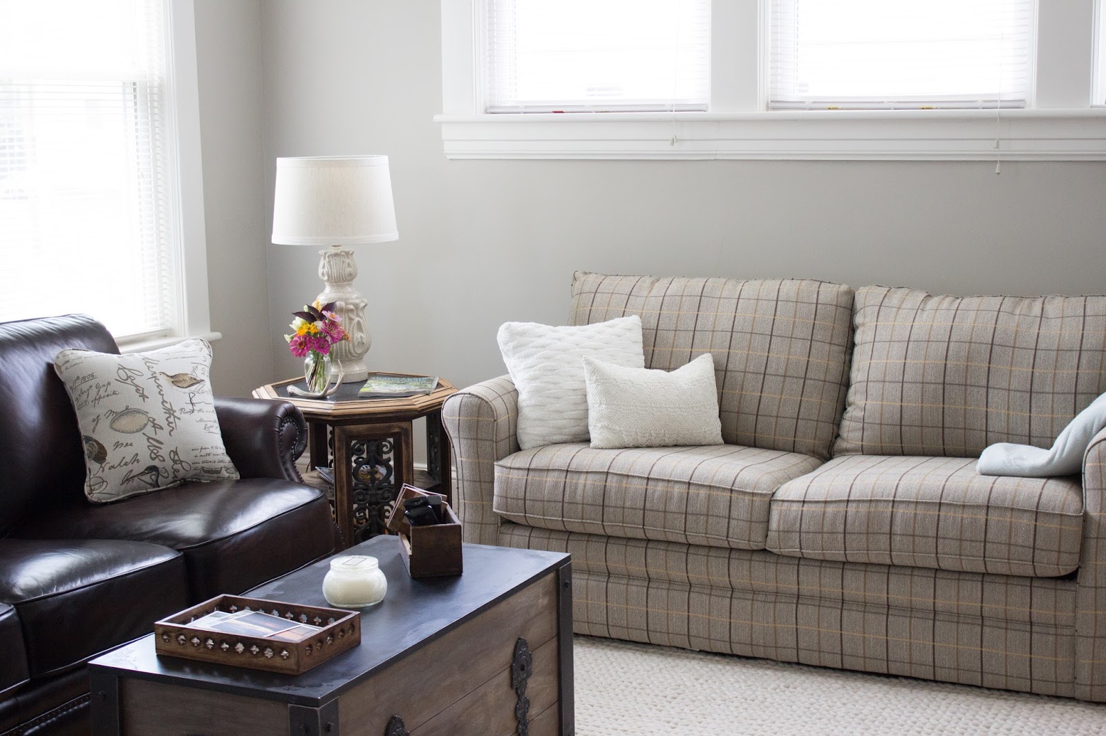
We already had this (English)leather chair, and were looking for a matching chair to have a set, but ended up finding a sofa in the company warehouse for the same price as a chair, so we jumped on that in a hurry to add two additional seating spots to the room!
Our Irish element is the natural wool rug in a super cozy cable knit sweater pattern.
And for Scotland...one of our heart-homes in the world, we ended up with a tweed plaid hide-a-bed couch and Scottish lace pillow:
Funny story about the couch: we thought we'd give the stock color (soft mossy green) version of the sofa a shot, with the understanding that if it didn't look great, we could return it and special order a soft gray at no additional cost. - We brought the moss home. Hated it. Ordered the gray. - Two weeks later, we got a call from the furniture store, and come to find out: the gray color had been discontinued and they forgot to pull the sample from the floor. To make it up to us, they allowed us to choose ANY specialty fabric of our choice at no additional change, plus we got to keep the moss couch until our special order came in. Enter: Plaid (and super elated Kristin). I can't imagine the room without it. 

Providential mistake? Maybe so, maybe so.

Here is our existing buffet ($20 thrift store find over 10 years ago...three colors later) that fit perfectly on one wall, and stores candles, wax melts, games, CDs, and DVDs like a charm. Also note the Scottish bagpipe chanter from my brief flirtation with becoming a piper. 
Above that are some vintage English fox hunt pictures that previously hung in our bedroom at Windy Poplars.
We also love that when you're sitting down and look out the three high windows, you can just see the tippy top of our neighboring church, which reminds us of a church you might see in the Cotswolds:
We swapped out the light fixture for something a little more casual and modern. I knew from the start that I wanted a simple drum chandy, but couldn't find one comfortably within the budget. So, though this was a bit more busy looking that I originally wanted with the "X" design, the shape and size were perfect for the room, and it was a steal at Lowes.
And that's about it! I'll leave you with one last angle of my current favorite room in the house (probably because it's really the only room that's done-ish). It's the place where we can escape to and relax at the end of the day, with no glaring projects tapping on our shoulders. Still a few finishing touches needed here and there, but what would home be, if not ever in need of attention? ;-)

*Note: Sorry these images are smaller than usual, but some were from my cell, so I couldn't properly size the width to match my big camera pics. :-)

Tuesday, August 8, 2017

Kitchen Progress

Hello, friends! Whew! What a couple of months it has been. 

"Full steam ahead" has been our MO - and thankfully, that steam is finally starting to slow down, and we are able to breathe at a normal pace, and enjoy everyday living again! Still a TON to do here at Ingleside, but all of the big projects and must-dos are checked off our list. And the rest can now wait until we're good and ready... 

Thought I'd kick this return to blogging off with a few "before" and "progress" pictures of our kitchen. I don't want this to turn into a home improvement blog, nor do I enjoy posts with 300 pictures of nearly the same thing. So hopefully we'll keep things tame-yet-informative around here as I begin the process of sharing what we've been up to the past few months.

Firstly, the kitchen was not in bad shape. It had been remodeled about 13 years ago, and things were still holding up ok.- The walls were a sage green, and really, were what was dating the space the most. A quick coat of paint solved that problem! In the first picture you can see the beginnings of the cut-in of the new color...sort of a soft mushroom/bisque color to go with the old world pitted floor tile.
 And here is the "after" once the full coat of paint was complete. Already, much better! This picture also highlights the bottom cabinets which were in rough shape. The top were passable (though a cherry finish is not my favorite) so we decided to leave them and focus on the lowers: lightly sanding and using a de-glosser before giving it a few coats of paint.
 Also note in these pre-lower-cabinet-paint frames, the color of the granite. Though unique, I was not a fan.

Ok, I confess, I actually HATED it. It looked like good old Virginia clay had been smeared all over the counters...just so. much. terracotta. ICK. So when we were considering what color to paint the cabinets, I suggested we find a color in the granite we actually liked (a light grayish-quartz) and try to match the cabinets to that to down play the orange-y red (which the cherry cabinets highlighted) and highlight the gray veins of the stone instead.
 And you know what?!! It actually worked!!! *praise hands* While I would still never choose this granite, I don't mind it at all anymore. The lighter neutral color really toned down the original mud-look, and you (well, I) barely notice how very "dirt-y" it is. WIN!
So, quandary: I can't decide whether to paint the toe-kick. At our last home, we painted it a matte black, and added legs/braces to make the cabinets look more like furniture, which I loved. BUT, I feel like these simple shaker design fronts wouldn't really lend themselves to that... So, what would you do? Paint it to match the cabinet fronts? Leave it? Paint it black?