Hello there! Back to our regularly scheduled home progress posts...
And this one is for those of you who just can't get enough (translation: it's definitely an over-share post...so get comfy!)
Let's start with the "Befores", shall we?:


Hello, Yellow
Yikes. This color reminded me of a rich lemon meringue pie (it was more intense in person than these pictures are letting on), and just kind of screamed at you - even from the font door (this room is straight ahead, once you walk through the foyer). Even though it was a "happy" color, it kind of made me angry every time I was in there. Ha!

Anyway, this was the dining room of the house - attached to the foyer (and the kitchen via the laundry hallway). Let's have one more "Before":

Ok, so as noted in the post title, we decided to make this room our den. There were several reasons for that, including: how cozy yet bright and cheerful the room is thanks to five windows and a door transom, the fact that it was in the back of the house - where I think a den should always be tucked away if it possibly can, it was quieter because the exterior walls do not face the street, and there were more den-furniture arrangement possibilities because of how the doorways, windows, etc. were situated in this room than there were in the current living room.
So first order of business:
PAINT!

Ahhhhh....much better. It actually took us three similar colors to land on our final. Mainly because even though the colors matched in small doses, the changing light of the foyer did not play nicely with the first two colors, which were a touch cooler in nature. In the above pic you can see the first two tones meeting at the corner seam. Our third coat, and final color ended up being:
Revere Pewter
A perfect blend of cool and warm, and a neutral that seemingly goes with everything we throw at it!

Also, if you scroll back up to the yellow walls, isn't it amazing how much the color change makes the molding pop?
Ok, so onto our theme. Because we all know I'm a theme-girl.
We have spent a good bit of time in the British Isles over the past few years, and the homes and decor there all scream "hygge" to us (look it up, if you don't know what hygge is...that'll be another blog post for another day).
We love the warm rich textures, the natural fibers, the timeless patterns... They just invite you to come in, put your feet up, and stay awhile! So, we decided to try and incorporate elements of Ireland, Scotland, and the English Countryside into our decorating scheme - working with what we already had and searching for authentic-feeling additions to fill in the gaps.
And this is where we landed:

Of course our musical gallery wall is a major feature of the room that has nothing to do with Great Britain, but screams "home" to us.
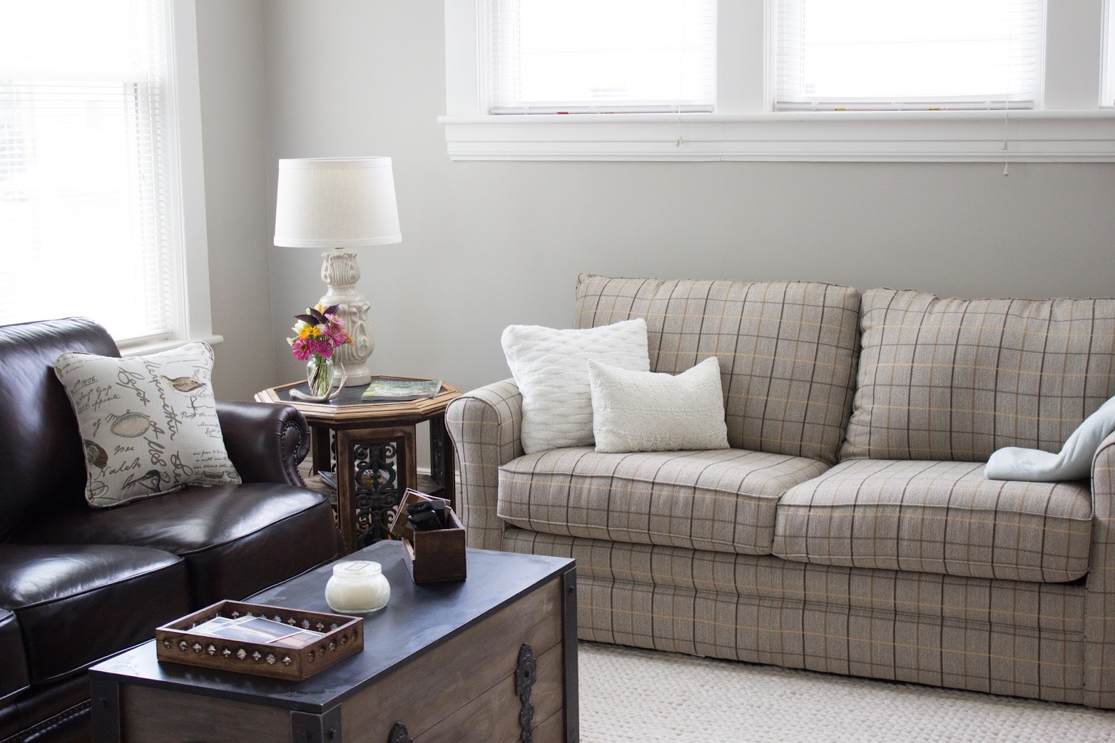
We already had this (English)leather chair, and were looking for a matching chair to have a set, but ended up finding a sofa in the company warehouse for the same price as a chair, so we jumped on that in a hurry to add two additional seating spots to the room!

Our Irish element is the natural wool rug in a super cozy cable knit sweater pattern.

And for Scotland...one of our heart-homes in the world, we ended up with a tweed plaid hide-a-bed couch and Scottish lace pillow:

Funny story about the couch: we thought we'd give the stock color (soft mossy green) version of the sofa a shot, with the understanding that if it didn't look great, we could return it and special order a soft gray at no additional cost. - We brought the moss home. Hated it. Ordered the gray. - Two weeks later, we got a call from the furniture store, and come to find out: the gray color had been discontinued and they forgot to pull the sample from the floor. To make it up to us, they allowed us to choose ANY specialty fabric of our choice at no additional change, plus we got to keep the moss couch until our special order came in. Enter: Plaid (and super elated Kristin). I can't imagine the room without it.
Providential mistake? Maybe so, maybe so.
Here is our existing buffet ($20 thrift store find over 10 years ago...three colors later) that fit perfectly on one wall, and stores candles, wax melts, games, CDs, and DVDs like a charm. Also note the Scottish bagpipe chanter from my brief flirtation with becoming a piper.

Above that are some vintage English fox hunt pictures that previously hung in our bedroom at Windy Poplars.

We also love that when you're sitting down and look out the three high windows, you can just see the tippy top of our neighboring church, which reminds us of a church you might see in the Cotswolds:

We swapped out the light fixture for something a little more casual and modern. I knew from the start that I wanted a simple drum chandy, but couldn't find one comfortably within the budget. So, though this was a bit more busy looking that I originally wanted with the "X" design, the shape and size were perfect for the room, and it was a steal at Lowes.

And that's about it! I'll leave you with one last angle of my current favorite room in the house (probably because it's really the only room that's done-ish). It's the place where we can escape to and relax at the end of the day, with no glaring projects tapping on our shoulders. Still a few finishing touches needed here and there, but what would home be, if not ever in need of attention? ;-)
*Note: Sorry these images are smaller than usual, but some were from my cell, so I couldn't properly size the width to match my big camera pics. :-)